Bringing back the play with purposeful branding...
- RebekahDP

- Jul 23, 2024
- 3 min read

Earlier in the year I was invited to lead a rebrand with a name change for an established organisation known as 'YOBS', an acronym for Youth Opportunities Board Solihull. They had started out with a logo designed by themselves in Canva, with good intentions but little design knowledge. Here's is a 'before shot' ...

I think you'll agree that while it does the job, there is a lot going on with colour. It looks very sporty too. However, the organisation supplies services to young children as well as youth and whilst providing sporting activities - this was not their core offering.
After a conversation or two with the (recently expanded) leadership team I got to creating a different version of my research and analysis process which kicks-off my creative process. I needed to establish the name change first and get it right, instinctively I knew this 'current playful yet negative name had to go' but needed to understand the 'why' so I created an additional survey to accompany my usual briefing questions.
By sharing a few pages from my presentation, you can see some strong examples of how my deeper process highlights the disconnect on what the current name means externally vs internal values that the leaders hold:

Overall, the results show that the word YOBS means negative associations externally against their positive values to be a 'community of leaders creating opportunities for children and young people'.
I then make sure we address their answers to my brief questionnaire and conversations around values, missions and aspirations to support the name change.


It became clear, very quickly that the current acronym wasn't representing them in the way they wanted it too. I suggested that we swap the Youth, to 'young' to accommodate both children and young people. Also the relevance of the word 'board' was not important, because on first sight the 'consortium' structure of the organisation being made up of multiple organisations was not important to their audience. However I did encourage them to tell this story in their marketing or about page on their new website.
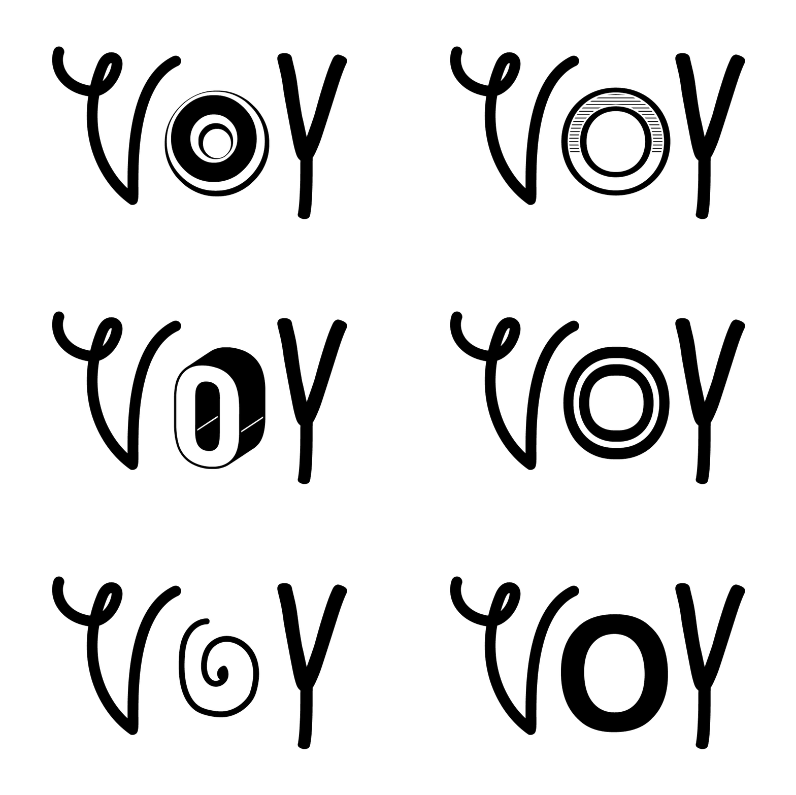
The new acronym was agreed to simply represent 'Young Opportunities Solihull' and to be referred to as 'YO Solihull'. Now that was all agreed, I could get onto the creative bit (my favourite part).
I provided more than one concept in the end, but to my joy the most creative concept was victorious. By consistently revisiting the brief and values work we had completed, the inspiration of 'play' was strong for me. I decided to cut up some potatoes and create some bespoke lettering for the logo.

The nostalgia in this activity for me was strong - not only because I did this when I was kid with my mum, but I did this with my son often too. A simple, yet effective method was then finalised on screen in Adobe Illustrator. Below you can see a sneaky-peak at an earlier version of the process and the creative theory that underpins my mindful branding journey:

There is always some zig-zagging that happens from this point with refinement and colour palettes. The end result was a brand board with logo files - aka 'Path 1' from my branding services - a flexible branding service tailored to suit your next adventure. You can find out more about my mindful brand options at the bottom of this page
The final logo and branding package also included hand drawn illustrations for decorative use and to build personality. With almost limitless possibilities and an extensively bold colour palette - the brand had a new, meaningful visual brand to match tehir expertise.

You can see how their website builder then utlised their brand investment to drive the look and feel of their new website too.
This project was huge, deep, transformative and provided the punch of enthusiasm in the right way. Services included:
Renaming and research
Creative audit
Conceptualisation
Hand drawn icons
Brand personality development
Brand board output
Final execution
Graphic design
Website design consultation service
Would you like to have a conversation about how your values are represented in your current branding? Pop me an email or book straight into my diary here


Comments