My mindful brand evolution
- RebekahDP

- Jan 12, 2024
- 3 min read
Updated: Jan 22, 2024
A successful brand has a story and purpose and can reinvent itself many times over - I mean take a look at LEGO. I realised that my own had outgrown itself over the last few years and my logo was feeling alien to me. Can you resonate? - if so you should book a call with me.
After creating many successful logo designs and brand packs for my clients, I began to realise how disconnected I was from my own and I needed to become my next client! (every graphic designers nightmare!)

When I thought about it, I realised that my logo was over a decade old. I invented the original name 'Arell' over 20 years ago when combining the phonetics of the initials of my forename and maiden name - the 'R' for Rebekah as 'are' and 'L' as 'ell' for Lock (I can hear half of you sighing about how to actually pronounce it now too). My surname is different, I am different, my clients are different and ultimately, I have a good idea of the way I want my creativity to impact the world.
I had to change it to reflect the evolution of my business.

I didn't know how to start so I began to work with a wonderful coach with creative industry experience - I went on a journey with her. We unpicked a lot of truths and 'untruths' about my creativity. I opened up to the fact that I am a natural artist first and trained as a designer second. But don't let that confuse you. I am a traditionally-trained graphic designer with 20 years experience from fast-paced environments...I know when something is off-centre or catching my eye for the wrong reasons. I know how to execute and market my clients' services and products. But for me and my business, I realised I was not marketing me as me - and that had to change.
Through my coaching I used doodling and created a piece of art based on my values which embodies my mantra: "I am Rebekah di Palma, I design for purpose. I bring the freedom of an artist and the discipline of a designer to creating clear and effective visual communications".

I can't remember when the new name came to me, but much of the feedback I get from clients is the positive 'journey we go on' with my creative process and how I value my clients as the hero to their stories and I am the guide. I liked the idea of a voyage, and adventure. So the new name 'Voy' was born.
"What’s wonderful - is the journey you go through with Rebekah. She takes you along her trail of thought, it evolves with every twist and turn - that process is so exciting." ~ Founder of Source, award winning restaurant and VFC
In addition to the name change and my internal journey, I had developed a curiosity for bringing my mindful practices to the forefront of my business. Coincidentally, or as I like to say 'as the universe would have it', I was given the opportunity to explore this with Soundasleep club and began to offer clients workshops to create a deeper connection with their values. My business was forming and evolving in 2023.

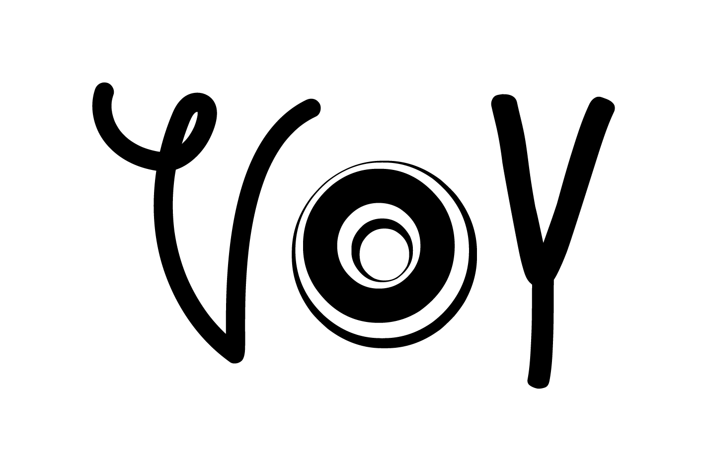
The logo font issue was real (my peers nodding at their screens). So I drew it myself and have a variety of alternatives whereby the 'o' is an official font. The concept being, that the 'v' and 'y' in my signature style of writing is the 'creative support', my solid-foundation. Encompassing my designer skills and knowledge with the flexibility of the 'o'. The master logo being the one this gif stops on...

So this is me now. Arell will be redirecting traffic here, my emails will transition over the next year or so. I am Rebekah at voy.design - let's go on a creative journey. It will be mindful, artistic and executed with precision and I can't wait to join you on yours.


Comments